User Research Part I: Heuristics Evaluation
Overview
Slack aims to integrate processes across programs and teams, but it’s interface is counter-intuitive to use at times. The lack of status reporting leaves users wondering if tasks are completed successfully. Furthermore, the platform does not support previewing files before sending, leading to mistakes. The platform’s lack of priority tagging and indicating unread messages also lead to missed messages.
This report aims to evaluate the compliance of Slack’s features with recognised usability principles (the “heuristics”), and provide recommendations for such issues. The focus would be on its desktop and Android mobile apps.
Methodologies
Nielsen’s 10 Heuristics (Nielsen Norman Group)
The Nielsen’s 10 heuristics evaluation is a “usability engineering method for finding the usability problems in a user interface design so that they can be attended to as part of an iterative design process.”
Severity Ratings (0 to 4)
This set of ratings aim to evaluate if the issue is a:
- 0 = None issue: I don’t agree that this is a usability problem at all
- 1 = Cosmetic only: need not be fixed unless extra time is available on project
- 2 = Minor usability problem: fixing this should be given low priority
- 3 = Major usability problem: important to fix, so should be given high priority
- 4 = Usability catastrophe: imperative to fix this before product can be released
In order to do so, I had to assess and weigh the issue based on these attributes:
- Frequency: Is it common or not?
- Impact: Will it be easy or difficult for the users to overcome?
- Persistence: Is it a one-time problem or a repeated one?
Below is the overview of my heuristics evaluation of Slack. I would be focusing on the top 4 issues with ‘Major Usability Problems’ that I have identified with the Slack desktop and/or Android mobile apps.

4 Main Usability Issues
01Visibility of System Status:
Lack of status reporting for message delivery

“I have sent the message to Nic yesterday, but till now she has not replied me! I wonder if she has received it? Or was she simply unhappy with how I critiqued her idea, and does not want to reply me?”
Impact: I believe the user might be worried and unsure whether or not to…
- attempt another method of communication for urgent matters (such as calling), or
- wait indefinitely
Recommendation:
Use icon(s) (e.g. a tick ✔️) to indicate if a message has been sent/received/read etc, and possibly create relevant privacy settings to allow customisation of this feature for each user.
02 Consistency & Standards:
Confusing search functions in mobile vs desktop apps
Mobile app: Search function is split into two — the ‘Jump To’ and search (🔍) buttons — that allows for search of different things. Eg: ‘Jump To’ searches People and Channels, while 🔍 searches Messages and Files.
Desktop app: Straightforward, only one search bar, which allows for search of everything (all 4 categories mentioned above) within Slack.


Impact: Mobile users might find it confusing and face too much cognitive load in their search.
Recommendation:
• Remove the ‘Jump To’ search bar altogether while preserving the current Search (🔍)feature, or
• Repurposing the ‘Jump To’ search bar to incorporate the functionality of the actual Search (🔍) feature, and thereafter removing the current 🔍 icon.
03 Error Prevention:
Lack of preview of attached documents

“I don’t have time to check the actual file name.” (User proceeds to send document to boss, then realised it was the wrong one…)
Impact:
- Inability to undo the action that might have left a bad impression on the recipient.
- Troublesome to check if attached document is correct.
Recommendation:
Add a separate ‘preview window’, change the hovering cursor from text [ I ] to a hand cursor [ ] to indicate that it is clickable, and adding a prompt to remind user to check before sending.
04 Help users recognise, diagnose and recover from errors:
Lack of clear error notification and instructions for error recovery
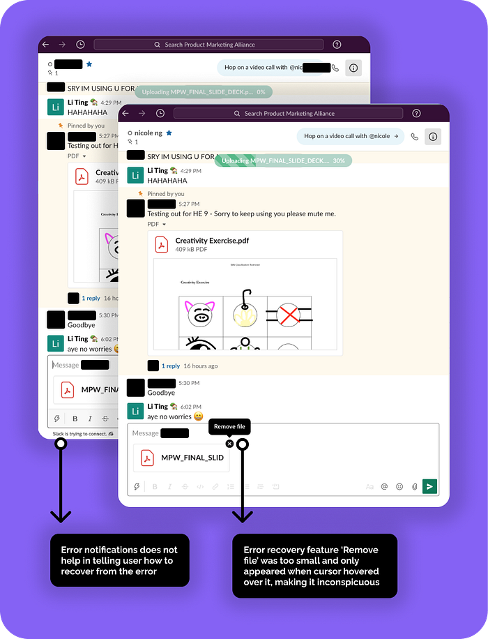
“This is taking so long… Why is my document not uploading at all? Is my wifi provider down? Is my document too large? What is happening???”
Impact:
- User completely unable of performing the task of uploading document
- This guessing game could elicit negative emotions, and waste many man-hours that in turn reduces productivity.
Recommendation:
Inform the user of the issue in a more prominent way, and provide actionable suggestions and guide the user to recover from the unfortunate error. (insert pic)
The above is an evaluation of 4 out of the 10 Nielsen’s heuristics. The remaining can be found in the full slide deck attached below! :)
Final Thoughts
User Experience goals: What do I expect users’ interaction to be like?
I expect that users usually have to learn how to use the platform quickly, in order to be productive as soon as they start work in the company. To learn fast, they might require help and support from fellow colleagues, especially for more advanced functions such as Advanced Search Filters, Inviting people to join a channel, and leveraging the use of Threads. Company administrators should consider limiting access to unneeded functions to make the learning curve more gentle, and get more people accustomed to the platform in a timely manner.
Usability goals: Easy to Learn, Effective to Use, & Enjoyable to Interact?
Slack is quite a decent platform, with few problems to fix to make it a wonderful app that integrates work and informal communications with colleagues. The platform’s clean interface allows for quick access to relevant pages. Once the glaring design and interaction issues are rectified, the platform could be very helpful to most organisations.
Communication goals: Is the interaction meaningful & serves its intended purpose?
Slack is indeed a good replacement for emails, and it also doubles up as instant messaging platform. For instance, it is equipped with functions or integrations with 3rd party platforms, such as sharing of documents, online voice and video calls, instant messaging, and group chats varying in member sizes (‘channels’). This wide array of functions is important to allow work communications to be organic and seamless in the post-COVID new normal.
My Reflection
This Heuristic Evaluation has allowed me to explore the various perspectives one might have in uncovering usability problems. Having consulted some friends about their Slack experiences before deriving on the above findings, I learnt to critically assess each issue, determine the related heuristic, evaluate its impact on users and brainstorm actionable recommendations.
Overall, I had a lot of fun (and sleepless nights 😆) on this project! There’ll be more posts following up from this report, such as my journey on a literature review on the topic, creating a Product Requirement Document, prototype, and more. 😊
Let’s connect on LinkedIn too. Till then, ciao!~ 👋🏻
